The SEO Building Blocks for Great Content Part 1 – Website Core Information Pages
Read Time: 3 minutesIt’s time to dive into the ENDURANCE vault and share another huge inside peak and how we tell clients to format informational pages. Toward the end of 2020, we really want to help everyone understand just how important User Experience is, and laying out content properly really helps with engagement metrics that Google tracks.
Formatting a Landing Page for a Section of a Website
Let’s start by focusing on a landing page for an entire section of a website.
 This page introduces an entire section of your site. It could be a services page that describes the services your company offers. It might be more hierarchical and describing all the different kinds of cats you’re reporting on for a school project. Or it could be describing the many aspects of a particular topic (maybe the best features of a car).
We call this page a “core” page on a website. It probably goes in the main navigation and it’s important for users to know its’ there.
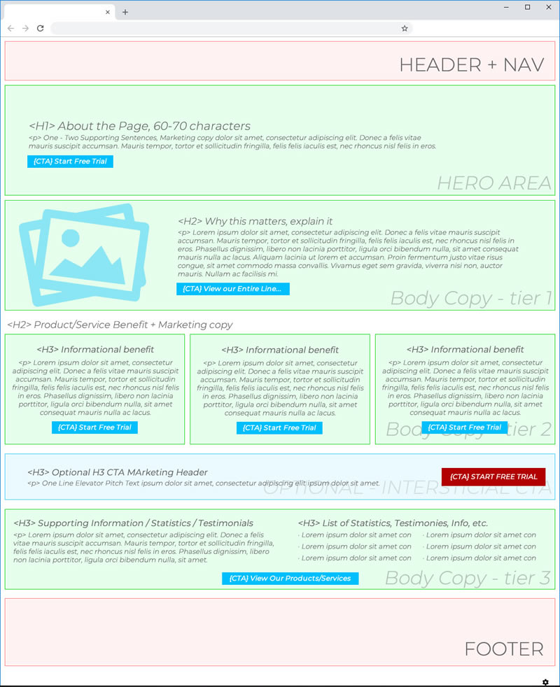
Here’s an example graphic:
Laying out a Core Page of a Website
Now the core page of a website does not need to be laid out exactly like this example to reach #1 in search engine results pages. This is only an example layout.
TOP – Hero Area Content

The Hero are really should describe the following:
-
- What this page is about
- Why this page provides value (or matters to the user)
- And how a user can learn more (or push to convert if applicable)
- Include H1 (think of this like a chapter title of a book or quick, one sentence abstract for a whitepaper)
Tier 1 Body Copy

This might be my favorite part of a core informational page. This is where the storytelling really begins. This is where you can craft a narrative. This is where you can entice a user! Focus on what makes this page’s topic/focus unique. HOOK THE USER!
The Tier 1 Body Copy should include the following:
-
- Why this page matters! THE HOOK!
- Imagery (be sure to follow rules of image optimization)
- Lead with H2 tag [quasi optional]
- Call to Action (CTA) [OPTIONAL]
Tier 2 Body copy (Marketing Speak)

Here is where you can push to convert. Hopefully, you’ve hooked your target, and they want to know more. This section could be your top three features explained with a link to view all the features. This could be the top three selling points for a user with a hard CTA. The pattern is three here. Pick three amazing somethings you want to convey and push to convert here.
Section should include
-
- Three important things! More information, marketing speak – they’re hooked, convert them.
- Imagery (include an image with each of the three points)
- Lead each of the three items with an H3 tag
- CTA the user here… it’s time with the flow of the content
- “View More” [OPTIONAL]
- If these are benefits, features, etc. be sure to link to the next page (the deep dive on this specific item) and keep the flow going
Interstitial Call to Action (CTA)

Whatever the main point of your entire, overall site is… call it out here. If you’re selling products, lead to the shop page. If you’re providing services, push to a contact us page. If you’re a software as a service product, push to “request a demo.” This row/area of the page is entirely optional, but why not include it?
This section should include:
-
- Your CTA for the entire site.
- Great background imagery
- Optional h3 heading
- One-line elevator pitch – think of it like a tweet – get to the point
Tier 3 Body copy (Supporting information)

Now we’re just placating to google search (sort of). The users will find value in this as well of course, but let’s add some content to boost our search presence while providing more information for user engagement. #ValueContent
Include:
-
- Supporting information.
- Technical information
- Statistics
- User testimonials
- Ratings/Reviews
- Anything of value
- Include at least 2 sections, but feel free to have 4, 5, 6… even 10 sections
- Lead with H3 tags
- Try to include lists (ul/ol list items)
- CTA buttons or “learn/view more” are ok and optional. Be careful not to inundate users with CTAs
- Supporting information.
Landing Page Layout Example for Websites
This article is an example for people who might be struggling to make landing page layouts for core webpages on a website. We’ve tried to present many options in one example; the content itself is nested well and follows a progression, we’re trying to loop in customization, and we’ve got narrative + marketing on the same page. All while providing value and flow.
Is this what Google wants? We think so.
What about heading and sub-headings (h1, h2, and h3 tags)? How should I nest content properly?
We did list some of them as optional… the thing to remember these days is not to make sure you have h1 or h2 tags on the page in as much as your content is nested properly.
For example – DO NOT do this:
-
- H1 – blah blah blah
- H2 – lorem ipsum, lorem ipsum
- H1 – blah blah blah
- H1 – blah blah blah
- H4 – asdf asdf asdf
- H2 – lorem ipsum, lorem ipsum
- H2 – lorem ipsum, lorem ipsum
- H1 – blah blah blah
This is not proper content nesting.
H1, H2, H3 etc. are all heading and sub-headings. Use them as such. You wouldn’t put a tertiary heading after a primary heading. Or a primary heading after a secondary heading. Nest your content properly.
For example – proper nesting:
-
- H1 – blah blah blah
- H2 – lorem ipsum, lorem ipsum
- H3 – hehe haha hehe haha
- H3 – hehe haha hehe haha
- H2 – lorem ipsum, lorem ipsum
- H3 – hehe haha hehe haha
- H3 – hehe haha hehe haha
- H3 – hehe haha hehe haha
- H2 – lorem ipsum, lorem ipsum
- H1 – blah blah blah
Needing help with Landing Page Content
We all kind of need help 😉
Google is a black box. These recommendations really are what we’ve seen work + latest trends to get somewhere in the 50-60% confidence range. I think that’s the best we can do with Google. We really never know with any better certainty, and if someone tells you they do know with 100% accuracy, definitely don’t use their services.
If you need content help (content strategy, content marketing, content development, etc.) please feel free to reach out. In the least, we’ll give you an analysis you can take and do whatever you’d like with (complimentary btw).


